A game art direction study
Watercolor game environments
Watercolor game environments use translucent-looking color, irregular edges and areas of visual quiet to suggest pigment on paper. GRIS makes that language monumental and abstract; Dordogne brings it into an intimate, recognizable landscape. The useful choice is not simply how much texture to add, but where forms should resolve and where color can spread beyond them.
Artstyle visual analysis of the screenshots below. These references describe appearance, not a verified account of how the original assets were produced.
Explore watercolor landscapes referencesWhat defines this look
Edges that change
Let some boundaries appear precise while others soften or break apart. If every edge has the same blur, the scene loses the contrast between deliberate drawing and loose wash. Keep navigable ground easier to read than distant foliage.
Paper as light
Pale or unpainted-looking space can carry the brightest parts of the image. Notice how it separates foreground marks rather than treating white as a background that must be filled.
Large color washes
Group the scene into a few connected color areas. Small marks can sit inside those masses, but should not fragment the composition into equally busy patches.

Monumental washes
GRIS
GRIS sets a tiny figure against deep red landforms and a pale circular sun. Angular ruins interrupt the softer color, giving the player a clear structure within the wash.
What to studyCompare the crisp architecture with the more diffuse sky.
Explore these references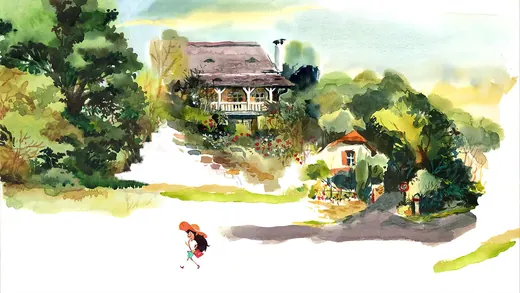
An intimate painted place
Dordogne
Dordogne surrounds a country house with green foliage that dissolves into white space. The path remains understandable even though the edges of the image feel unfinished.
What to studyKeep a firm route through a loose painted environment.
Explore these referencesWhat to avoid
A watercolor texture laid uniformly over a finished render does not establish this hierarchy. Decide which shapes carry the scene before adding pigment-like variation; test the result at gameplay size.
Does watercolor game art have to use pastel colors?
No. GRIS uses strong reds in this example. Translucent-looking washes, changing edges and negative space do more to establish the medium than a pastel palette alone.
Build your reference sheet.
Collect one landscape for large color masses, one for soft foliage and one for crisp architecture. Annotate the playable path and identify which edges your artist should leave unresolved.
Start a free lookbookYour free lookbook includes 20 references and sharing.
Visual analysis by Artstyle. Screenshots belong to their respective rights holders and are provided as references, not licensed production assets. Source links appear with each image.
Related visual studies
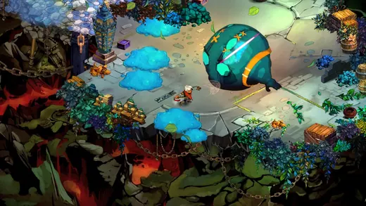
Painterly game art
Explore painterly game art in Hades, Bastion and Disco Elysium. Compare screenshots and collect references for illustrated environments and characters.
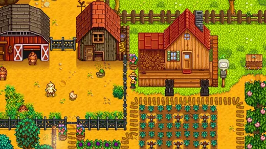
Pixel art game references
Compare pixel art in Stardew Valley, Fields of Mistria and Hyper Light Drifter. Explore palettes, object readability and environments for your game lookbook.
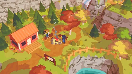
Low-poly game environments
Low-poly game environments make shape, proportion and color carry information that a detailed surface might otherwise supply.