A game art direction study
Dark ink and gothic illustration in games
Dark ink game art uses heavy shadow shapes and selective contours to make a scene readable with relatively little light. Hollow Knight and Darkest Dungeon show different balances between delicate scenery and dense graphic weight. The crucial choice is where a form disappears into black and where its edge must remain visible.
Artstyle visual analysis of the screenshots below. These references describe appearance, not a verified account of how the original assets were produced.
Explore dark ink illustration referencesWhat defines this look
Black as a shape
Treat deep shadow as a designed area, not just the absence of lighting. Connect small dark marks into larger masses that support the composition.
A selective contour
Important figures need enough visible edge to separate from nearby forms. Let less important boundaries merge rather than outlining every object equally.
Restrained accents
A pale face, attack effect or small warm highlight can carry attention. Leave enough subdued space around the accent for it to matter.
A small bright protagonist
Hollow Knight
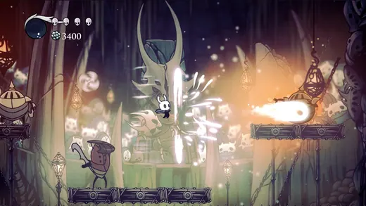
Hollow Knight separates a white-masked figure and bright attack effects from ornate muted scenery. The environment is detailed, but the lightest shapes identify the action.
What to studyFollow the strongest light-dark boundary around the knight.
Explore these references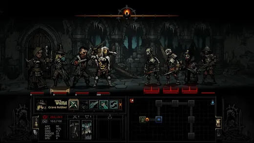
Heavy graphic weight
Darkest Dungeon
Darkest Dungeon crowds outlined adventurers and skeletal enemies into a dark hall. Deep shadow unifies the figures while selected faces, weapons and interface accents remain visible.
What to studyCompare the black masses within and between characters.
Explore these referencesWhat to avoid
Darkness alone does not create an ink aesthetic. A uniformly underexposed image loses the deliberate relationship of line, fill and paper-like highlights.
Is gothic art always desaturated?
No. Gothic architecture and threatening subject matter can coexist with strong colors. A dark ink treatment is one way to organize them, not a required palette.
Build your reference sheet.
Build references for shadow grouping, face readability and environmental ornament. State which details should disappear at the normal camera distance.
Start a free lookbookYour free lookbook includes 20 references and sharing.
Visual analysis by Artstyle. Screenshots belong to their respective rights holders and are provided as references, not licensed production assets. Source links appear with each image.
Related visual studies
Painterly game art
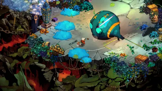
Explore painterly game art in Hades, Bastion and Disco Elysium. Compare screenshots and collect references for illustrated environments and characters.
Pixel art game references
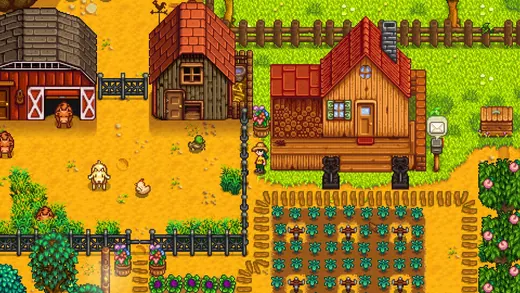
Compare pixel art in Stardew Valley, Fields of Mistria and Hyper Light Drifter. Explore palettes, object readability and environments for your game lookbook.
Watercolor game environments
Watercolor game environments use translucent-looking color, irregular edges and areas of visual quiet to suggest pigment on paper.