A game art direction study
What defines Disco Elysium’s art style?
Disco Elysium pairs a weathered, painterly environment with an interface that must accommodate detailed reading and character information. Its atmosphere depends on irregular surfaces, subdued color relationships and the arrangement of small human figures inside larger spaces. Use the environment and interface as separate references rather than treating every part as the same painting.
Artstyle visual analysis of the screenshots below. These references describe appearance, not a verified account of how the original assets were produced.
Explore Disco Elysium referencesWhat defines this look
An inhabited surface
Debris, uneven edges and worn structures suggest a place with a history. Group those details around larger architectural forms so the environment remains understandable.
A restrained focal hierarchy
Not every scene needs a saturated highlight. Differences in value, shape and local detail can guide attention within a quieter palette.
An editorial interface
Text, portraits and equipment information need their own organization. A painterly game world does not require making every label or panel equally irregular.
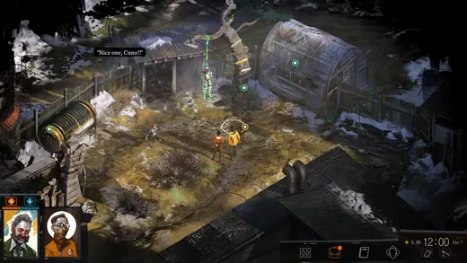
The weathered city
Disco Elysium - The Final Cut
An elevated intersection contains small figures, vehicles and damaged architecture. Irregular texture sits within a recognizable arrangement of streets and walls.
What to studyLook for the large spatial divisions beneath the surface marks.
Explore these references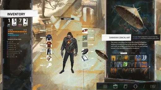
Structured character information
Disco Elysium - The Final Cut
The equipment view separates a central figure from item slots, an inventory grid and text. Its order provides a useful counterpoint to the irregularity of the environment.
What to studyIdentify how the grid and text regions reduce search effort.
Explore these referencesWhat to avoid
Adding rough brush textures everywhere can make a game harder to read without creating this atmosphere. State which surfaces should feel worn and which interface elements must remain precise.
Should a painterly game also have painterly UI text?
Not necessarily. Readable typography and ordered panels can coexist with irregular painted environments. The contrast can make both parts more effective.
Build your reference sheet.
Build separate references for environmental texture, city composition and information layout. Write a note explaining what should remain clean and consistent.
Start a free lookbookYour free lookbook includes 20 references and sharing.
Visual analysis by Artstyle. Screenshots belong to their respective rights holders and are provided as references, not licensed production assets. Source links appear with each image.
Related visual studies

What defines the Hades art style?
Hades combines richly illustrated environments with sharp shapes, strong color separation and emphatic character presentation.
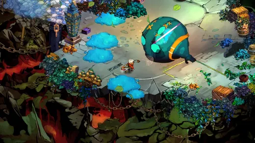
Painterly game art
Explore painterly game art in Hades, Bastion and Disco Elysium. Compare screenshots and collect references for illustrated environments and characters.
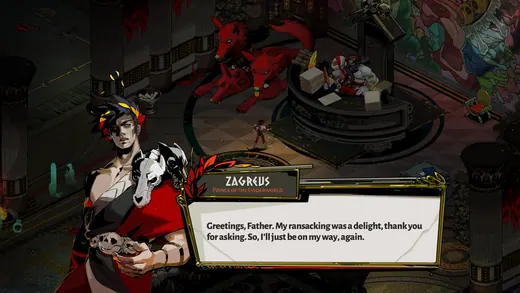
Game dialogue boxes and choice UI
Game dialogue UI coordinates the speaker, the words and the player’s next action.