Game interface design study
Game dialogue boxes and choice UI
Game dialogue UI coordinates the speaker, the words and the player’s next action. Hades and Persona 5 Royal use different framing styles while both give portraits a strong role. A useful comparison asks how the interface distinguishes the current speaker from the environment without reducing the text to decoration.
Artstyle visual analysis of the screenshots below. These references describe appearance, not a verified account of how the original assets were produced.
Explore dialogue boxes referencesWhat defines this look
A clear reading region
Keep text on a stable, high-contrast surface. Decorative edges can establish character, but should not compete with the line of text or make the text region unpredictable.
Speaker identification
Portrait, name and placement can work together. A large portrait is useful only if its relationship to the words is immediately clear.
A separate action state
Reading, advancing and choosing are different states. Study their cues independently; a static conversation frame does not demonstrate how choices or timing work.
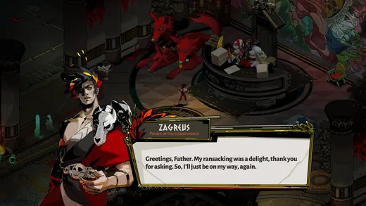
Portrait with a quiet text panel
Hades
Hades gives the portrait considerable space while a cream panel holds the dialogue. The surrounding world remains visible behind the conversation.
What to studyCompare the visual weight of portrait and text.
Explore these references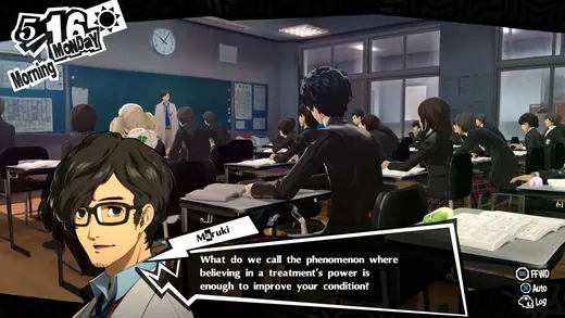
Graphic conversation framing
Persona 5 Royal
Persona 5 Royal uses a jagged white border around a dark speech shape beside the portrait. The border adds energy while maintaining a distinct reading area.
What to studySeparate the expressive outer contour from the calm text interior.
Explore these referencesWhat to avoid
Do not copy a fixed screenshot’s text size into a shipped interface without testing longer strings, localization and different screen sizes. Visual hierarchy must survive real content.
Should dialogue cover the environment?
It depends on whether spatial action still matters during conversation. Compare how much of the scene remains visible and specify whether the game pauses or continues behind the panel.
Build your reference sheet.
Build references for speaker identity, text surface and choices. Add your longest likely line to a prototype before approving the frame.
Start a free lookbookYour free lookbook includes 20 references and sharing.
Visual analysis by Artstyle. Screenshots belong to their respective rights holders and are provided as references, not licensed production assets. Source links appear with each image.
Related visual studies
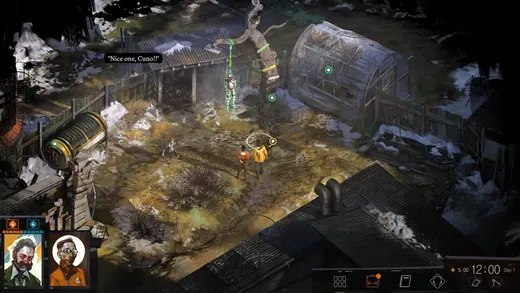
What defines Disco Elysium’s art style?
Disco Elysium pairs a weathered, painterly environment with an interface that must accommodate detailed reading and character information.
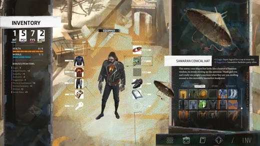
RPG inventory UI design references
RPG inventory UI must distinguish what a character owns, what they have equipped and what will change when an item is selected.
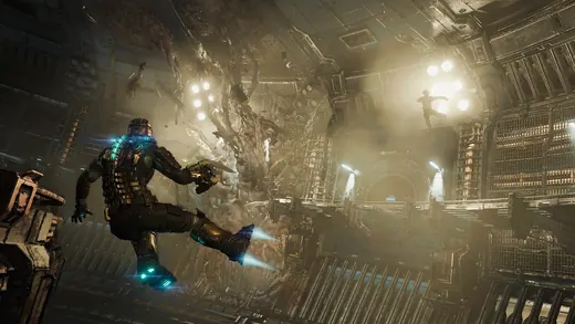
Diegetic game UI and in-world HUDs
Diegetic UI presents information as part of the game world rather than only as a separate screen overlay.