A game art direction study
Neon cyberpunk city references
Neon cyberpunk cities depend on the relationship between dark structure and concentrated artificial light. Signs, windows and streets should establish scale and direction, not just color the entire frame pink and blue. Cloudpunk and Cyberpunk 2077 offer useful comparisons between simplified city masses and detailed street-level clutter.
Artstyle visual analysis of the screenshots below. These references describe appearance, not a verified account of how the original assets were produced.
Explore neon cities at night referencesWhat defines this look
Darkness around light
Reserve large areas for subdued building masses. A sign feels luminous because nearby surfaces are darker; uniformly bright neon removes that difference.
Vertical layers
Stack windows, elevated routes and signs at distinct depths. Overlapping layers can suggest a much larger city without making every building equally detailed.
Local color stories
Give each district or focal point a limited relationship of colors. Reflections can extend those colors into the street while preserving their apparent source.
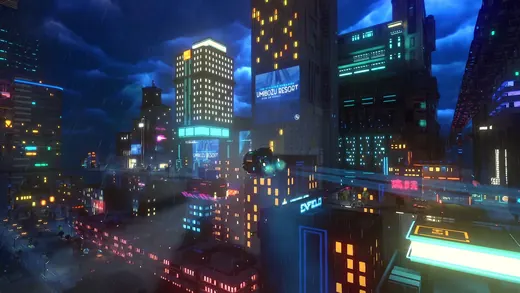
The city as stacked light
Cloudpunk
Cloudpunk fills a dark skyline with bands of windows and signs. Its simplified building forms make repeated lighting patterns especially important to the city’s identity.
What to studyGroup the windows into rhythms rather than isolated dots.
Explore these references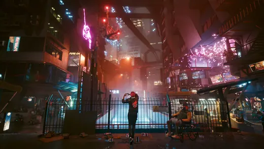
The street as a frame
Cyberpunk 2077
Cyberpunk 2077 surrounds a small figure with signs, architecture and warm reflections. Near objects create a frame before the eye travels into the illuminated street.
What to studySeparate foreground silhouette, middle-distance figure and background signs.
Explore these referencesWhat to avoid
Neon is lighting, cyberpunk is a broader setting, and voxel is a construction style. Keep these separate in your brief so an artist can change one without losing the others.
How can a neon scene stay readable?
Limit the strongest lights, use dark gaps between buildings and give the player or destination a distinct value or silhouette. More emissive surfaces do not necessarily improve clarity.
Build your reference sheet.
Choose a skyline, a street and a sign treatment. Annotate where the brightest value belongs and which surfaces should remain quiet despite the busy setting.
Start a free lookbookYour free lookbook includes 20 references and sharing.
Visual analysis by Artstyle. Screenshots belong to their respective rights holders and are provided as references, not licensed production assets. Source links appear with each image.
Related visual studies
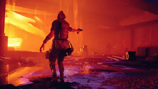
Brutalist game environments
Brutalist game environments draw attention to heavy architectural masses, repeated structural elements and the relationship between a person and an oversized space.
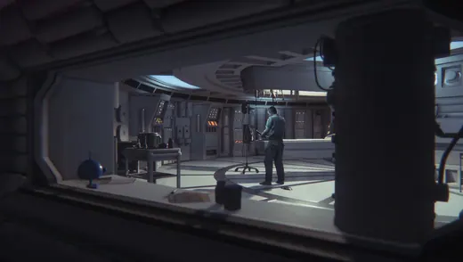
Retro-futuristic spaceship interiors
Retro-futuristic spaceship interiors make advanced technology feel physical through heavy housings, practical lights and surfaces that suggest maintenance.
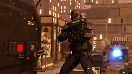
Games that look like XCOM
Compare games that look like XCOM: Gears Tactics, Phoenix Point and Mutant Year Zero. Screenshots, art-direction notes, and references for your own game.