Game interface design study
Paper, manuscript and document game UI
Paper-based game UI turns reading and choosing into actions associated with documents, books or a working desk. Papers, Please and Pentiment use different arrangements: overlapping inspection materials and clearly separated choice panels. The material metaphor should support the task while preserving legibility.
Artstyle visual analysis of the screenshots below. These references describe appearance, not a verified account of how the original assets were produced.
Explore document interface referencesWhat defines this look
A believable document structure
Headers, fields, margins and stamps give a document a recognizable purpose. Establish that structure before adding aging or decorative paper texture.
Readable marks
Text and essential symbols need enough contrast against the paper. Variation in color or edge can establish material without passing through every letter.
Task-specific arrangement
A desk for comparing documents has different needs from a menu of choices. Decide whether overlap, side-by-side placement or a vertical list best supports the action.
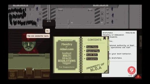
A working inspection surface
Papers, Please
Papers, Please places a rulebook and passport on a cramped desk. Their shapes and fields make documents objects that must be compared.
What to studyIdentify which information is visible simultaneously.
Explore these references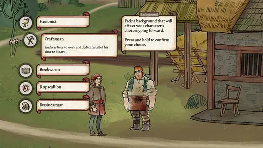
Choices as manuscript-like panels
Pentiment
Pentiment presents pale choice tabs with dark lettering beside an illustrated character scene. The clear blocks provide a stable reading order within a historical-looking frame.
What to studyCompare decorative framing with the simpler internal text area.
Explore these referencesWhat to avoid
Tiny ornate type and heavy paper texture can make a convincing prop into an unusable interface. Test actual reading at gameplay size and with longer text.
Does paper UI have to look old?
No. A contemporary form, notebook or technical manual can use the same document metaphor. Choose typography and layout that fit the intended object.
Build your reference sheet.
Collect document anatomy, paper treatment and layout separately. Label the fields a player needs to compare or the order in which choices should be read.
Start a free lookbookYour free lookbook includes 20 references and sharing.
Visual analysis by Artstyle. Screenshots belong to their respective rights holders and are provided as references, not licensed production assets. Source links appear with each image.
Related visual studies
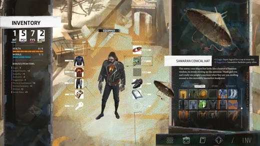
RPG inventory UI design references
RPG inventory UI must distinguish what a character owns, what they have equipped and what will change when an item is selected.
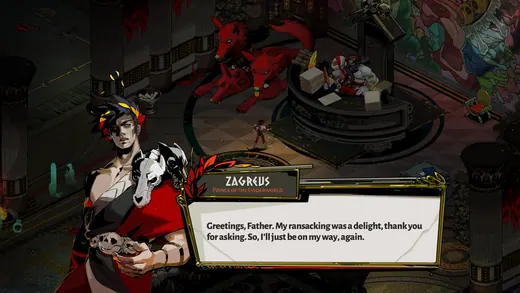
Game dialogue boxes and choice UI
Game dialogue UI coordinates the speaker, the words and the player’s next action.
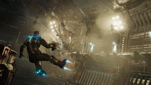
Diegetic game UI and in-world HUDs
Diegetic UI presents information as part of the game world rather than only as a separate screen overlay.