Game interface design study
RPG inventory UI design references
RPG inventory UI must distinguish what a character owns, what they have equipped and what will change when an item is selected. Disco Elysium and Cyberpunk 2077 show different visual treatments of that shared task. Start with the comparison the player needs to make, then decide how much of the character model and world to keep visible.
Artstyle visual analysis of the screenshots below. These references describe appearance, not a verified account of how the original assets were produced.
Explore inventory referencesWhat defines this look
Ownership versus equipment
Separate stored items from active slots. A clear spatial distinction helps the player understand a move or replacement before they read every label.
Stable comparison space
Keep names, attributes and item details in a predictable region. The selected item can change without moving the information needed to evaluate it.
State beyond color
Selection, focus, equipped state and unavailable items need distinct cues. Shape, border and text should support color so that the interface survives different displays and users.
Character-centered organization
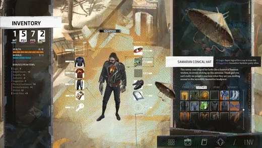
Disco Elysium - The Final Cut
Disco Elysium places the figure between equipment slots and a grid of belongings. The character acts as a stable anchor while surrounding areas carry different information.
What to studyDistinguish the storage grid from the active equipment region.
Explore these references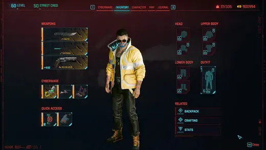
A technical equipment frame
Cyberpunk 2077
Cyberpunk 2077 uses thin red frames and cyan highlights around a central figure. Its stronger graphic treatment still depends on a clear separation of regions.
What to studyStudy the hierarchy before borrowing the futuristic colors.
Explore these referencesWhat to avoid
A dense PC inventory is not automatically a good controller reference. A screenshot cannot establish focus order, navigation speed or how comparisons behave in motion.
What should an inventory reference sheet include?
Include the grid or list, equipment slots, item details, selection states and a comparison example. One attractive overview rarely explains the whole interaction.
Build your reference sheet.
Collect a resting screen and a selected-item state. Annotate storage, equipment, details and the next action; test keyboard or controller navigation separately.
Start a free lookbookYour free lookbook includes 20 references and sharing.
Visual analysis by Artstyle. Screenshots belong to their respective rights holders and are provided as references, not licensed production assets. Source links appear with each image.
Related visual studies
Deckbuilder and card game UI references
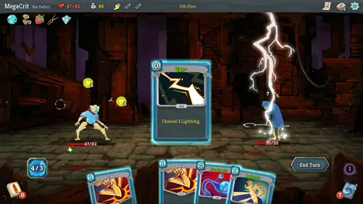
Card game UI must make individual cards readable while showing how a hand changes the larger game state.
Game dialogue boxes and choice UI
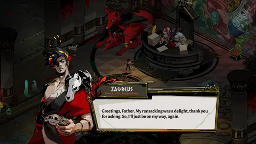
Game dialogue UI coordinates the speaker, the words and the player’s next action.
Diegetic game UI and in-world HUDs
Diegetic UI presents information as part of the game world rather than only as a separate screen overlay.